Introduction to Responsive Web Design
BY JAMES ALL @PSDTOHTML5 18 MAY,2016
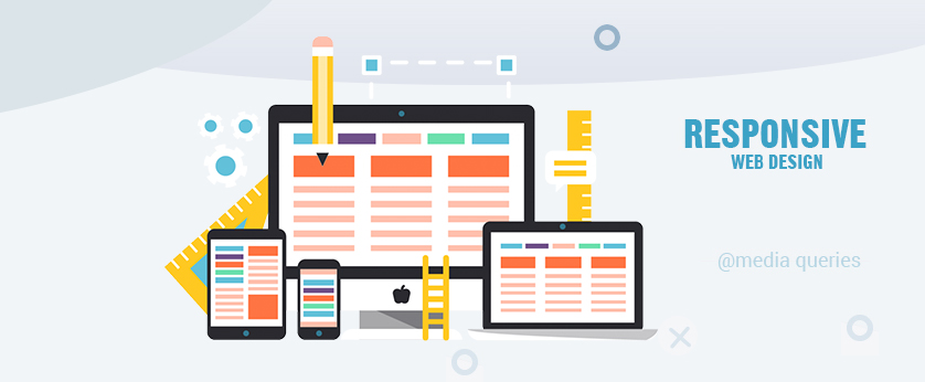
Nowadays, your website will be visited by a wide variety of devices: desktops with large monitors, mid-sized laptops, tablets, smartphones, and more.
To achieve an optimal user experience as a front-end engineer, your site should adjust its layout in response to these varied devices (i.e., to their varied screen resolutions and dimensions). The process of responding to the form of the user’s device is referred to as (you guessed it) responsive web design (RWD).
Why is it worth your time to study responsive web design examples and shift your focus to RWD? Some web designers, for example, instead make it their life’s work to ensure a stable user experience across all browsers, often spending days on end addressing small issues with Internet Explorer.
Note that the best practice is to use BEM only with classes, and not IDs because classes allow you to repeat names if necessary and create more consistent coding structure. Also, if you want to break your website into organized modules, it should consist of the same structure: block, element, and modifier. Where each block can have multiple elements, and both block and elements can have multiple modifiers. However, let’s first start with the basic BEM structure and explain it with examples.
This is a foolish approach.
Some web designers spend days on end addressing small issues with Internet Explorer and leave their mobile users as second-hand visitors. This is a foolish approach.
Mashable called 2013 the year of responsive web design. Why? Over 30% of their traffic comes from mobile devices. They project that this number could reach 50% by the end of the year. Across the web in general, 17.4% of web traffic came from smartphones in 2013. At the same time, Internet Explorer usage, for example, accounts for just 12% of all browser traffic, down about 4% from this time last year (according to W3Schools). If you’re optimizing for a specific browser, rather than the global smartphone population, you’re missing the forest for the trees. And in some cases, this can mean the difference between success and failure—responsive design has implications for conversion rates, SEO, bounce rates, and more.
THE RESPONSIVE WEB DESIGN APPROACH
What’s commonly glossed over about RWD is that it’s not just about adjusting the appearance of your WebPages; instead, the focus should be on logically adapting your site for usage across different devices. For example: using the mouse does not provide the same user experience as, say, the touchscreen. Don’t you agree? Your responsive mobile vs. desktop layouts should reflect these differences.
At the same time, you don’t want to be completely rewriting your site for each of the tens of different screen sizes on which it might be viewed—such an approach is simply infeasible. Instead, the solution is to implement flexible responsive design elements that use the same HTML code to adjust to the user’s screen size.
From a technical point of view, the solution lies in this responsive design tutorial: using CSS media queries, pseudo-elements, flexible set grid layouts, and other tools to dynamically adjust to a given resolution.
MEDIA QUERIES IN RESPONSIVE DESIGN
Media types first appeared in HTML4 and CSS2.1, which enabled the placement of separate CSS for screen and print. In this way, it was possible to set separate styles for a page’s computer display vis-à-vis its printout.
<link rel="stylesheet" type="text/css" href="screen.css" media="screen">
<link rel="stylesheet" type="text/css" href="print.css"  media="print">
Or
@media screen {
    * {
        background: silver
    }
}
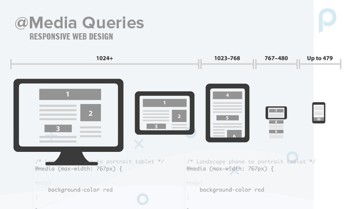
In CSS3, you can define styles depending on the page width. As page width correlates with the size of the user’s device, this capability thus allows you to define different layouts for different devices. Note: media queries are supported by all major browsers. This definition is possible through the setting of basic properties: max-width, device-width, orientation, and color. Other definitions are possible as well; but in this, case the most important things to note are minimum resolution (width) and orientation settings (landscape vs. portrait).
The responsive CSS example below shows the procedure for initiating a certain CSS file with respect to the page width. For example, if 480px is the maximum resolution of the current device’s screen, then the styles defined in main_1.css will be applied.
<link rel="stylesheet" media="screen and (max-device-width: 480px)" href="main_1.css" />We can also define different styles within the same CSS stylesheet such that they are only utilized if certain constraints are satisfied. For example, this portion of our responsive CSS would only be used if the current device had a width above 480px:
@media screen and (min-width: 480px) {
    div {
        float: left;
        background: red;
    }
    .......
}
“Smart Zoom”
Mobile browsers use so-called “smart zoom” to provide users with a ‘superior’ reading experience. Basically, smart zoom is used to proportionally reduce page size. This can manifest itself in two ways: (1) user-initiated zoom (for example, tapping twice on an iPhone screen to zoom in on the current website), and (2) initially displaying a zoomed-in version of a web page on load.
Given that we can just use responsive media queries to solve any of the problems at which smart zoom might be targeted, it’s often desirable (or even necessary) to disable zoom and ensure that your page content always fills the browser:
<meta name="viewport" content="width=device-width, initial-scale=1" />By setting initial-scale to 1, we control the initial page zoom level (that is, the amount of zoom upon page load). If you’ve designed your web page to be responsive, then your fluid, dynamic layout should fill the smartphone screen in an intelligent way without requiring any initial zoom.
In addition, we can disable zoom completely with user-scalable=false.
PAGE WIDTHS
Say you’re looking to provide three different responsive page layouts: one for desktops, one for tablets (or laptops), and one for smartphones. Which page dimensions should you target as your cutoffs (e.g., 480px)?
Unfortunately, there’s no defined standard for the page widths to target, but the following example responsive values are often used:
- 320px
- 480px
- 600px
- 768px
- 900px
- 1024px
- 1200px
However, a number of different width definitions exist. For example, 320 and Up has five default CSS3 Media Query increments: 480, 600, 768, 992, and 1382px. Along with the given example in this responsive web development tutorial, I could enumerate at least ten other approaches.
With any of these reasonable sets of increments, you can target most devices. In practice, there is usually no need to separately handle all of the aforementioned examples of page widths—seven different resolutions is probably overkill. In my experience, 320px, 768px, and 1200px are the most commonly used; these three values should be sufficient for targeting smart phones, tablets/laptops, and desktops, respectively.
PSUEDO-ELEMENTS
Building on top of your responsive media queries from the previous example, you also might want to show or hide certain information programmatically based on the size of the user’s device. Luckily, this too can be accomplished with pure CSS as outlined in the tutorial below.
For starters, hiding some elements (display: none;) can be a great solution when it comes to reducing the number of on-screen elements for a smartphone layout, where there’s almost always insufficient space.
But beyond that, you can also get creative with CSS pseudo-elements (selectors), e.g., :before and :after. Note: once again, pseudo-elements are supported by all major browsers.
Pseudo-elements are used to apply specific styles to specific portions of an HTML element, or to select a certain subset of elements. For example, the :first-line pseudo-element lets you define styles solely on the first line a certain selector (e.g., p:first-line will apply to the first line of all ps). Similarly, the a:visited pseudo-element will let you define styles on all as with links previously visited by the user. Clearly, these can come in handy.
Here’s a simple responsive design example in which we create three different layouts for a login button, one apiece for desktop, tablet, and Smartphone. On the Smartphone, we’ll have a lone icon, while the tablet will have the same icon accompanied by “User name”. Finally, for the desktop, we’ll also add a short instructional message (“Insert your user name”).
.username:after {
    content:"Insert your user name";
}
@media screen and (max-width: 1024px) {
    .username:before {
        content:"User name";
    }
}
@media screen and (man-width: 480px) {
    .username:before {
        content:"";
    }
}
Using just the :before and :after pseudo-elements, we achieve the following:

For more on the magic of psuedo-elements, Chris Coyier has a good write-up on CSS-Tricks.
SO, WHERE SHOULD I START?
In this tutorial, we’ve established some of the building blocks for responsive web design (i.e., media queries and pseudo-elements) and laid out some examples of each. Where do we go from here?
The first step you should take is to organize all of your webpage’s elements into various screen sizes. These responsive web design examples show the layout on different devices.
Take a look at the desktop version of the layout presented above. In this case, the content on the left (the green rectangle) could serve as some sort of main menu. But when devices with lower resolution are in-use (e.g., a tablet or Smartphone), it might make sense for this main menu to be displayed in full width. With media queries, you could implement this behavior as follows:
@media screen and (max-width: 1200px) {
    .menu {
        width: 100%;
    }
}
@media screen and (min-width: 1200px) {
    .menu {
        width: 30%;
    }
}
Unfortunately, this basic approach is often insufficient as your front-end grows in complication. As a site’s content organization is often differs significantly between mobile and desktop versions, the user experience eventually depends on the use of not only responsive CSS, but also HTML and JavaScript.
When determining responsive layouts for different devices, several key elements are important. Unlike desktop versions where we have enough space for the content, Smartphone development is more demanding. More than ever, it’s necessary to group specific contents and hierarchically defines the importance of individual parts.
For a Smartphone, it's more important than ever to group specific contents and hierarchically define the importance of individual parts.
The various uses of your content are also important. For example, when your user has a mouse, they can set the cursor above certain elements to get more information, so you (as the web developer) can leave some information to-be gathered in this way—but this won’t be the case when your user is on a Smartphone.
In addition, if you leave buttons on your site that then render on smartphones as smaller than a typical finger, you’ll create uncertainty in the usage and feeling of your site. Notice that in the image above, the standard web view (on the left) renders some elements completely unusable when viewed on a smaller device.
Responsive design elements have to be usable with both mice and touch screens. Such behavior will also increase the chances that your user makes an error, slowing down their experience. In practice, this can manifest itself as decreased page views, fewer sales, and less overall engagement.
OTHER RESPONSIVE DESIGN ELEMENTS
When using media queries, one should keep in mind the behavior of all page elements, not just those that are being targeted, especially when using fluid grids, in which case (as opposed to fixed dimensions) the page will be fully filled at any given moment, increasing and decreasing content size proportionally. Since widths are set in percentages, graphical elements (i.e., images) can get distorted and mangled under such a fluid layout. For images, one solution is as follows:
img {
    max-width: 100%
}
Other elements should be dealt with in similar ways. For example, a great solution for icons in RWD is to use IconFonts.
CONCLUSION
Until recently, website optimization was a term exclusively reserved for customization of functionality based on different web browsers. Alongside the inevitable struggle with different browser standards that we face today, this term now assumes adapting to devices and screen sizes with responsive web design as well. To cut it on the modern web, your site must know not only who’s viewing it, but how.
For more knowledge click on https://www.psd2html5.co/


